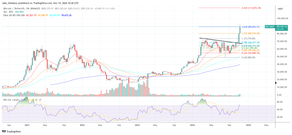
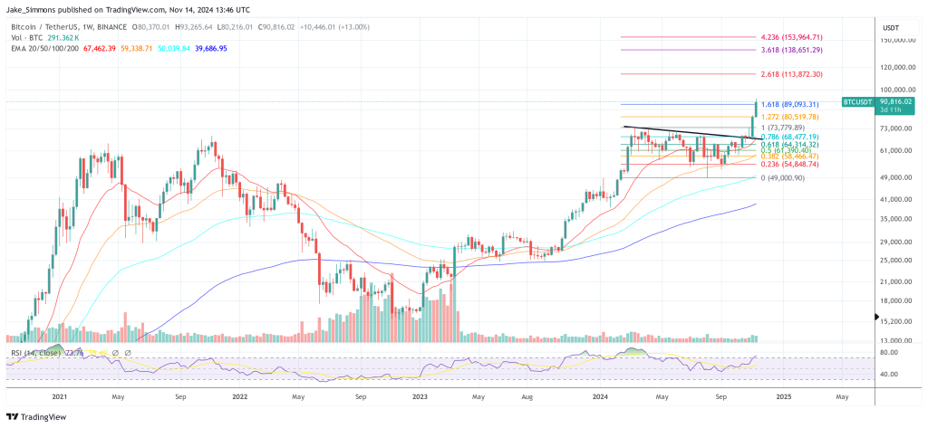
Edit2: I've updated the BTC numbers and graph. Not sure what I was smoking/which graph I was pulling the original numbers from. They were so far off it was clearly a mess up! Regardless, should be good now.
With so much doom over the state of crypto right now, I wanted to submit an actionable post for the sub that would help people out. It has specific steps to help you be more profitable than HODLing or DCAing.
What is the core tenet of investing? Buy low and well high. But how do we know when low is 'low' and when high is 'high'? IMHO, the basis of HODLing is the fear of not knowing that information. Better to squeeze my crypto hard now because what if I sell it and it goes to the moon?
We're going to use some simple technical analysis (TA) to help us easily see the lows and the highs. You're going to learn how to figure the direction change in the trend. And you're going to apply this trend trading strategy to buy when the trend is starting to heat up, and sell when it's starting to cool down.
If you're a seasoned TA trader this post might be below your pay grade. I want to keep this as streamlined as possible to help others feel confident that now is a good time to sell and now is a good time to buy.
To tease you with the results before we get into the How To, here is how I tested:
- Tested BTC, ETH and XMR. By the end of this post you'll feel confident knowing roughly when to buy and when to sell any crypto, derivative or equity
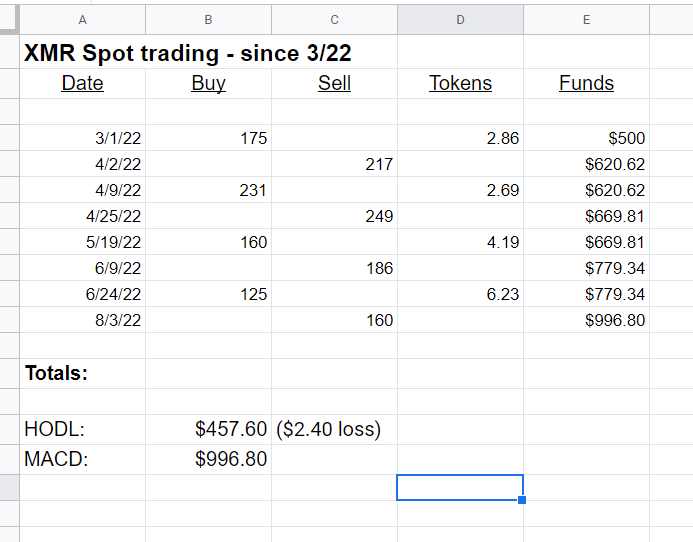
- Each test started with $500 on March 1st of this year
The price purchased or sold for each entry was the middle between the open and close price for that day. That should help to average out price fluctuations
The results of buying and HODLing vs applying this MACD strategy are below:
XMR:
- HODL: $457.60 ($2.40 loss)
- MACD: $996.80, or 218% better than HODLing. This was 8 trades over the 7 months.
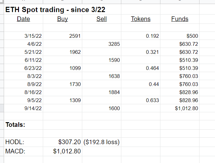
ETH:
- HODL: $307.20 ($192.80 loss)
- MACD: $1,012.80, or 330% better than HODLing. This was 10 trades over the 7 months.
BTC:
- HODL: $259.45 ($240.55 loss)
- MACD: $658.61, or 254% better than HODLing. This was also 8 trades over the 7 months.
This strategy averaged barely more than 1 buy or sell order per month. There is no need to be stuck to your computer or your phone for fear that you're going to miss something. I've linked to the specific price charts, as well as spreadsheets tracking the details of each of the tests below.
So, what is this magical MACD strategy and how do you implement it?
MACD stands for Moving Average Convergence Divergence. It's a big mouthful of words to describe a trend-following indicator. It shows us the direction the trend is heading. You'll use this information to see when price, or the trend, is headed far enough in a different direction. You'll then buy or sell appropriately.
A few things to note. You will definitely not catch the exact peak and bottom using this strategy. But you'll have a good enough idea that you'll be able to get in around those prices and still make healthy profits. As you can see above, and with your own testing, this strategy is definitely more profitable than HODLing.
Also before we get into it, you are responsible for any actions that you take based on this information. Although I have done a lot of TA and crypto derivatives learning and trading over the past year and a half, I am neither an expert nor am I your advisor. Past historical trends are not an indication of future returns, etc. If you are unsure about anything, feel free to post in the thread and I'll answer as best I can. I would also recommend doing more research on your own about MACD trading, MACD divergences, etc. if you think that would be helpful.
So let's get into it.
- You'll need an account on a charting platform to do your analysis. Navigate to TradingView and create an account.
- After you've created your account, search for a crypto using the Search field at the top of the screen. For example, enter BTCUSD and select Bitcoin / U.S. Dollar
- Now that you have the BTCUSD chart on your screen, we're going to change how it looks:
- Look along the top of the screen for the Indicators label. To the left of that label is a drop-down arrow labeled Bar's Style. Click that and select Candles. Candles, or candlesticks tell us much more information than a simple line graph of the price.
- Farther to the left you will see some time frames, e.g. 15m for 15 minutes, 4h for 4 hours, etc. We want to choose D, for one day.
- So far we're looking at the BTCUSD chart. We've changed the chart style to be candles, and we've changed the time frame to be 1 day. That means that each candlestick on the chart represents the price action for that one day.
- We're now going to add the MACD indicator, as well as customize it a bit to make it easier to see.
- Click Indicators along the top of the screen
- Type in MACD and select Moving Average Convergence Divergence from the list
- You should now have a second chart on your screen. It will contain two line graphs, and another graph which seems to go above and below an invisible '0' line. The MACD line graph indicates the 12 period (days, in our case) exponential moving average (EMA) of the price. If you changed the time frame to be 1H then the period would be hours. The MACD graph would then be the EMA of 12 hours. The signal line indicates the 26 period EMA line.
- Let's make some changes to make the MACD chart easier to read. These are the settings which I use, but of course feel free to adjust to your own liking:
- To the upper-left of the MACD chart you should see some text: MACD 12 26 close 9 EMA EMA. Place your mouse over top of that text and click the Settings cog.
- In the MACD Settings window, click Style. Ensure that Histogram, MACD, Signal and Zero Line are all checked
- To the right of Histogram > Color 0 select the graph button. Select Columns
- To the right of MACD > Color 0 select the line button. Select Line. Do the same for the Signal line right below.
You can see the colour options which I've selected for my graphs.
After you have the graph style and colours customized as you want click OK.
So... what are we looking at?
Compare the two line graphs with the price chart above it and you'll see some similarities. When the green MACD line starts to turn down under the red (signal) line, you can see that indicates that price is about to head downwards.
When the green MACD line starts to turn upwards to move above the red signal line, that indicates that price is about to move upwards.
When we look just at the price chart we have no idea which direction price is going to move. But with the MACD chart, we're given an indication about which direction the chart is going to trend.
And what about the histogram? The bar chart that rises and falls above and below an invisible '0' line?
That graph indicates the space between the MACD line and the signal line, i.e. the difference between the 12- and 26-EMA MACD and signal lines. The taller the histogram graph is indicates the strength of the movement of the MACD and signal lines.
So, the multimillion dollar question now that you've gotten this far... how do we make money with this information?
When the green MACD line is moving upwards and is just about to cross up and over the signal line is your indication to buy.
When the green MACD line is moving downwards and is just about to cross under the signal line is your indication to sell.
Something to watch out for:
When the height of the histogram bars is low for a period, that indicates that the market isn't quite sure of the direction. You'll see that the MACD and signal lines might be running horizontally over top of each other during that stage. Unless the histogram bars start to strengthen, I would hold off on any action until it's clear which direction the market wants to go.
You'll see two areas on the XMR chart (linked below) which show this. I've circled those areas in yellow. It's better to wait until you have clear direction of where the lines are going to move than to repeatedly buy/sell/buy/sell all within a few dollars of each trade.
The higher the time frame selected, the more accurate the information regarding the direction that price will go. However, if you choose too high a time frame you'll miss out on many buying and selling opportunities. For the purposes in this sub, I wouldn't recommend anything less than one day. But play around with the time frames and see what works best for you. As much as this is a science, it is also an art and there is definitely some nuance to it.
Here are the charts which I generated, marking off the buy and sell points according to the MACD chart. I also tracked each buy or sell in a spreadsheet:
I hope that you've found this helpful.
My goal was to inform the sub about a relatively 'set it and forget it' method for buying and selling. This way you won't feel the need to be glued to your phone or computer checking price action every few minutes. You can easily back test and gain confidence knowing that you can successfully buy and sell; not having to HODL for fear of missing out if the market runs away from you.
And if it does, so what? There are plenty of other opportunities. If you look in those charts I think that there are a number of times when I would have purchased higher than I sold for or vice versa. Regardless, the strategy still made significantly more money than HODLing.
[link] [comments]

You can get bonuses upto $100 FREE BONUS when you:
💰 Install these recommended apps:
💲 SocialGood - 100% Crypto Back on Everyday Shopping
💲 xPortal - The DeFi For The Next Billion
💲 CryptoTab Browser - Lightweight, fast, and ready to mine!
💰 Register on these recommended exchanges:
🟡 Binance🟡 Bitfinex🟡 Bitmart🟡 Bittrex🟡 Bitget
🟡 CoinEx🟡 Crypto.com🟡 Gate.io🟡 Huobi🟡 Kucoin.


Comments