Do you know the feeling when you lie on the grass in the park, look at clouds in the sky, and some of them remind you of animals, faces, and other things? Now imagine that people experience the same when they try to analyze price charts. That analogy makes sense, as charts can provide traders with hints about further price direction. If such a picture resonates in your head, congratulations, you have taken the first step toward understanding chart patterns.
Essentially, a chart pattern is a recognizable graphical representation of price movements over time. These patterns tend to repeat themselves, giving a trader an insight into what prices might do next, based on what they have done in the past. Chart patterns are typically divided into bullish (indicating potential price increases), and bearish (suggesting downward movement) versions. Traders and analysts use them to try to make informed decisions about buying, selling, or holding assets.
So, for instance, you see a chart pattern that looks like a cup, and you know that assets typically move up after its formation. Then you may anticipate an upward movement, and consider performing relevant actions.
There are numerous chart patterns, and Picasso might love them all, because they typically resemble geometric figures. But don’t worry, your geometry class grades are unlikely to affect your trading performance. In this article, we explore some of the most popular chart patterns in crypto trading, and explain how they might be interpreted.
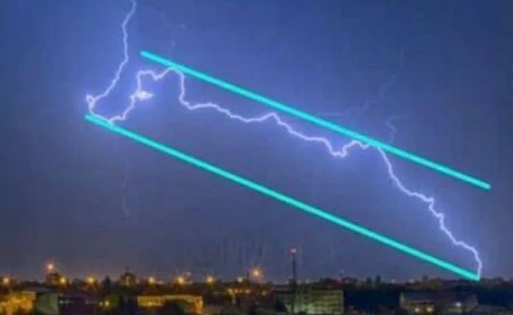
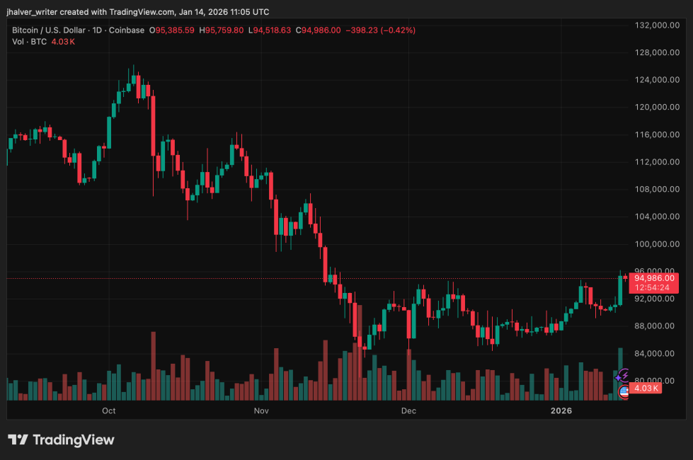
When traders look at the sky: this lightning seems to be inside a downtrend, having reached a key support level.
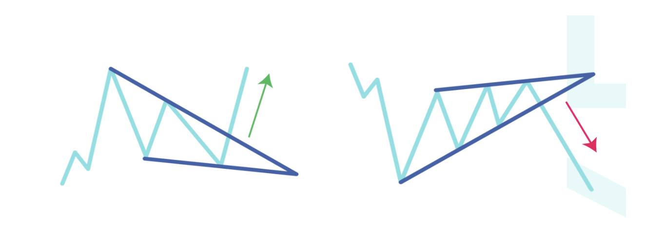
Triangles
In trading, there are multiple chart patterns identified as triangles, each offering potentially different signals for traders. The most widespread ones include:
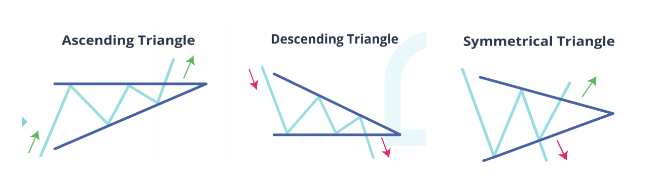
- Ascending triangle — represents a price consolidation between a horizontal upper line, and an ascending bottom trend line. It is considered to be a bullish pattern.
- Descending triangle — opposite to the ascending one, shows a consolidation between a descending upper trend line and a horizontal bottom line. It is typically viewed as a bearish pattern.
- Symmetrical triangle — looks like a “Play” button in your music app. It consists of a series of peaks and troughs that can be connected by two trend lines, converging in the middle. A neutral pattern, meaning the price has the potential to move in both directions.
Formation
All triangles are long-term patterns, so it may take weeks, or months, for them to form. These patterns are considered unconfirmed before the breakout of one of the triangle lines. Triangles are most effective on higher timeframes, but may also appear on lower ones.&
Each triangle pattern assumes that a line breakout should occur in one direction or another. Volume plays an important role as it typically increases at the moment of a breakout, pushing the price out of the triangle body. In some cases, the asset may retest the broken border to confirm the pattern, but this is not mandatory.
Signal
Typically, traders enter the market when the pattern is confirmed, meaning when one of the triangle lines is broken. These patterns suggest that a price target after the breakout is equal to their height, or the distance from the high and low of the earliest part of the triangle.&
So if the earliest triangle levels are $10 and $15, the pattern’s height is $5 (their difference). Traders add this number to the breakout point, let’s say it’s $12. Assuming it’s a breakout upward, a general price target for a pattern would be $17 ($12 + $5).
However, pattern formation doesn’t mean that the price will definitely reach its target. Other factors may come into effect, so consider paying close attention to price performance after the breakout to make relevant changes in a trading plan.
Flags
Flag is a continuation pattern that typically occurs after a sharp price movement.
Since crypto markets are known for their rapid price jumps and drops, flags are quite common. Depending on the prevailing price trend, flags can be either bullish or bearish:
- Bullish flag — represented by a large upward price movement (a flagpole), followed by a downward sloping channel/rectangle.
- Bearish flag — shows a downside flagpole, followed by an upward movement contained between sloping parallel trend lines.
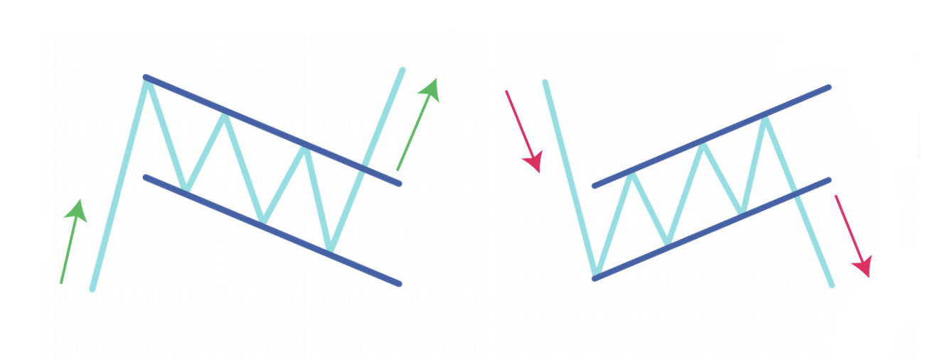
Left: Bullish flag. Right: Bearish flag.
Formation
All flags are typically viewed as short-term patterns, meaning they can be formed relatively quickly. In some cases, instead of a sloped rectangle that counters the established trend, the flag’s slope may follow its direction. It implies that this trend may be even stronger.
Volume is a key indicator. The pattern is accompanied by a strong volume for the flagpole, decreased volume during the flag body formation, and sharply increased volume at the body breakout. The catalyst of a decreased volume could be that buyers/sellers capitalize on profits after a significant price move.&
Signal
By default, flag formation signals that there should be a breakout in the direction of the established trend. So if it’s a bullish flag, then a breakout upward with a following price rally is anticipated. As for the bearish flag, a continuation of downward movement is expected.
Traders typically enter the market after a breakout of the flag body, in the direction of the established trend. In both cases, the further price movement may be as large as an initial flagpole.
Head and Shoulders
First of all, this chart pattern is referred to this way not because of a famous shampoo, but due to the visual characteristics resembling the human head and two shoulders. Depending on where the pattern is formed, there are two variations:
- Head and Shoulders — consists of three peaks, where the middle peak is the highest (head), while the side ones share a similar height (shoulders). There is also a so-called “neckline” that is drawn by connecting the lowest points of the pattern. The neckline can be horizontal, or have an upward/downward tilt.
- Inverted Head and Shoulders — consists of three valleys, where the middle valley is the deepest (head), while the left and right ones have an almost similar height (shoulders). The pattern has a neckline that represents the resistance level, and connects its peaks.
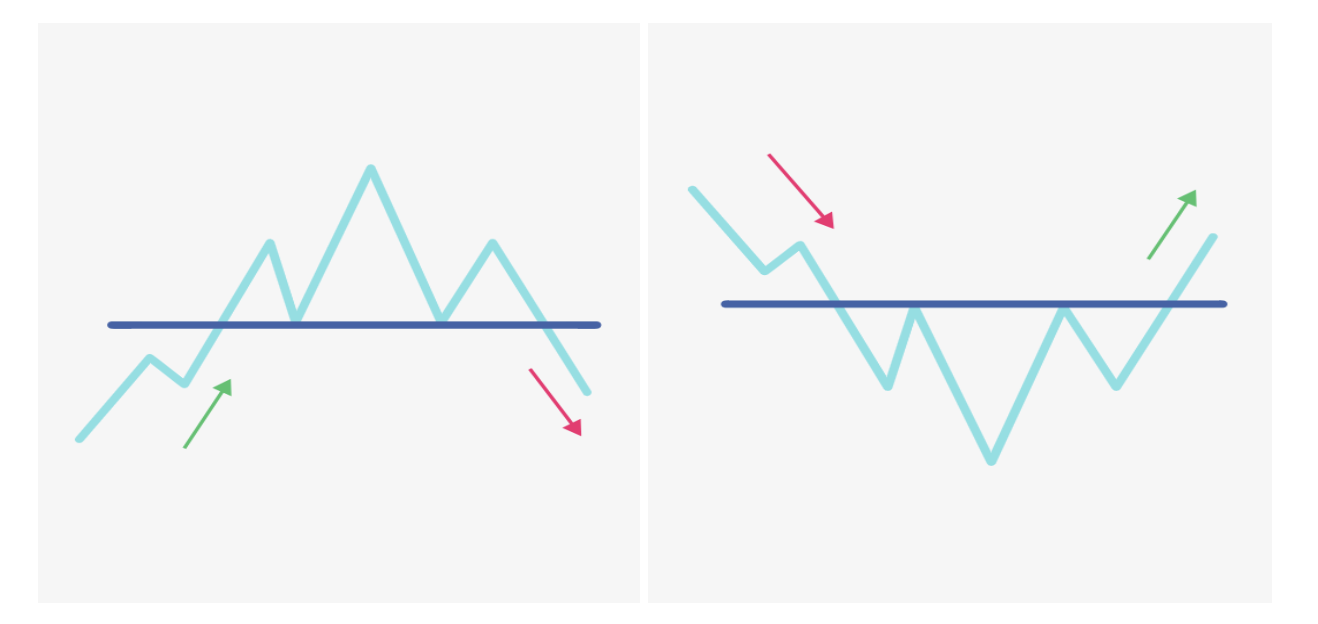
Left: Head and Shoulders. Right: Inverted Head and Shoulders
Formation
Head and Shoulders patterns are formed at the end of the established trend. The first shoulder typically has the largest volume within the pattern, and does not portend a potential price reversal. The head is an attempt to continue the established pattern. However, the volume could be lower compared to the first shoulder. This may indicate a waning trend momentum. The second shoulder represents a failure to update the previous high/low, and has the lowest volume. This hints that a trend is coming to an end, and may change.
Both patterns are confirmed when the price breaks the neckline after the formation of all three peaks/valleys. A breakout is typically accompanied by increased volume.
Signal
Head and Shoulders is a reversal pattern. Its regular version indicates a bullish-to-bearish trend reversal, while an inverted one signals that a downward movement is about to end. Traders typically enter the market after the neckline breakout, and formation of all three peaks/valleys.
The potential price target after confirmation can be calculated by adding the height of the head to the breakout point.&
Wedges
In general, a wedge is a period of market consolidation between two sloping support and resistance lines, that gradually converge. At first glance, wedges may look like triangles, but there is no horizontal support/resistance line, and both wedge lines follow the trend. So consider it a triangle brother that rides downhill/uphill.
There are two wedge types:
- Falling wedge — a consolidation with lower highs and lower lows (downward sloping) that converges towards a single point.
- Rising wedge —& a consolidation with higher highs and higher lows (upward sloping) that try to meet each other.
Left: Falling wedge. Right: Rising wedge.
Formation
A wedge represents a pause in the existing trend, or period of indecision. It forms when the price volatility slows down and traders’ activity becomes sluggish. This leads to the volume decrease while the price progresses through the pattern. This also means there should be an established trend before pattern formation.
Wedge lines require two, or three, highs/lows that must be above/below previous ones. The volume typically increases when the price breaks one of the trend lines, hinting that the period of indecision is complete.
Signal
Wedges can be both a reversal and continuation pattern, but it is typically considered to be a reversal one. A Falling wedge indicates the potential breakout of the resistance line, regardless of the price action before the pattern. If it occurs after a downtrend, it is considered a reversal pattern. If upward movement preceded the pattern, then a continuation one.&
The same applies to a Rising wedge. Regardless of the prior established trend, the asset typically indicates that a downtrend should come next. For both patterns, the price target after a breakout is typically equal to the height of the wedge.
Bonus: Bart Simpson
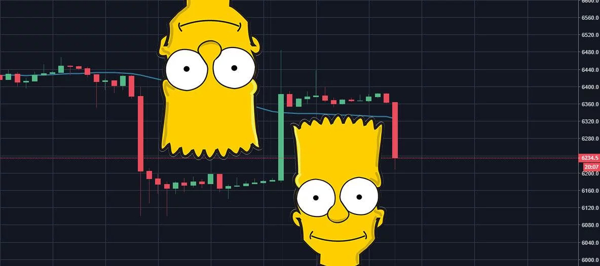
Bart Simpson is a Dogecoin in the world of chart patterns. Although it started as a joke, Bart soon became a quite popular pattern. Some even use it to identify potential market manipulations.
Barts, and inverse Barts, typically appear on lower timeframes. They consist of a sudden price jump, followed by a sideways consolidation period that resembles Bart’s haircut, and then a rapid price drop.&
As potential catalysts of Bart formation, crypto enthusiasts highlight low liquidity on certain markets, which leads to sudden price changes, and low volatility afterward. In addition, Barts may appear after execution of large orders, or after liquidations on crypto futures markets.
How to survive Barts? Just bear in mind how they may form to prepare for potential price fluctuations. Another way is to use a platform like Exchange Plus that features deep liquidity, and offers minimal price slippage.
What makes these patterns work?
As such, chart patterns are typically viewed as condensed identifiers of market expectations. All traders need is to understand the rules of different formations, and a little imagination. In this way patterns can act as templates of a kind for traders, which they can use to simplify their work.&
In addition, chart patterns are quite beginner-friendly, and straightforward to adopt in various trading plans. Most importantly, as more traders use them, the more valid they are considered to be. This means chart patterns are like influencers: the more followers they have, the more confident in their power they become.
What stands behind the popularity of the above formations? For the most part, it’s their simplicity. Most of the above patterns consist of a few lines, and have relatively straightforward formation conditions. This makes them easier to identify on the chart. Here is why simplicity is important:
- Self-replication — For a certain pattern to perform properly, a significant number of traders must “see” its formation, and trade following this pattern, after its confirmation. If you’re the only one who identifies a certain pattern, the rest of the market may not take it into account, and ignore it, potentially invalidating your observation. As a result, chart patterns must be intersubjective to work. The best way to achieve this is when patterns are straightforward.
- Frequent appearance — Since the above patterns are relatively simple in their shape, there are more opportunities for them to appear on a chart. This offers a larger sample of cases to analyze their performance, utility, and validation. So if you look for patterns, which have stood the test of time, it will most likely be those that have the most understandable shape. Dragons and dinosaurs on the chart are unlikely to work properly.&
Exchange Plus as a canvas for chart patterns
In addition to deep liquidity, and a suite of advanced trading tools such as sub-accounts and Stop Limit orders, our ultimate trading platform also offers users access to multi-functional price charts. They are powered by TradingView, one of the most popular charting tools, largely adopted by traders not only in crypto, but also in wider financial markets.& &
Exchange Plus empowers you to add as many technical indicators as desired, based upon your personal strategy. It provides an opportunity to make a comprehensive analysis, and execute your trading idea right away.
With a diverse toolkit, you can identify and confirm various chart patterns, finding new potential levels to enter and exit the market. The number of available tools even empowers you to unleash your inner artist!
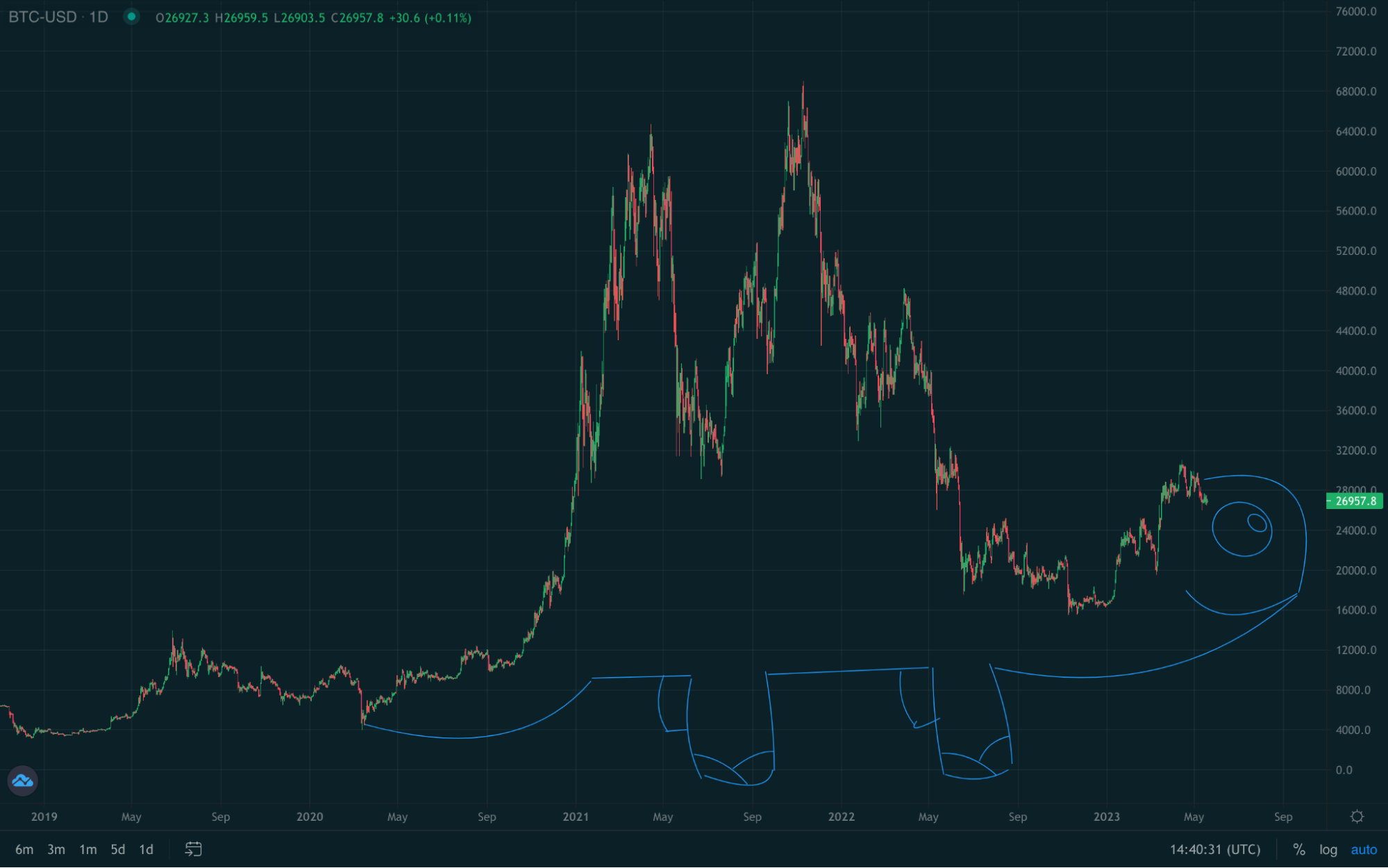
It’s so powerful that you can even draw a little dino… turtle. Sadly, not a real pattern.
Regardless of what you need to evaluate price movements, be it a single trendline, or a set of 10 different indicators, Exchange Plus is here to be your one-stop trading platform. Take advantage of 250+ crypto markets, and let your drawing skills unlock your trading potential.
Note: Exchange Plus is currently not available in the U.S.
Disclaimer: For information purposes only. Not investment or financial advice. Seek professional advice. Digital assets involve risk. Do your own research.

You can get bonuses upto $100 FREE BONUS when you:
💰 Install these recommended apps:
💲 SocialGood - 100% Crypto Back on Everyday Shopping
💲 xPortal - The DeFi For The Next Billion
💲 CryptoTab Browser - Lightweight, fast, and ready to mine!
💰 Register on these recommended exchanges:
🟡 Binance🟡 Bitfinex🟡 Bitmart🟡 Bittrex🟡 Bitget
🟡 CoinEx🟡 Crypto.com🟡 Gate.io🟡 Huobi🟡 Kucoin.


Comments