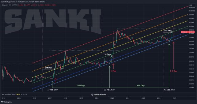
 | The Rainbow Chart for Bitcoin is pretty much a fun way of looking at long term price movements, disregarding the daily volatility “noise”. The color bands follow a logarithmic regression (introduced by Bitcointalk User trolololo in 2014). Not sure if we've hit the peak at 69420 last year in this halving cycle, but at this cycles half way point we have another 2 years to get into the red band when it will be off load time if you're inclined to follow this chart. So, we are now in the accumulation phase. Are you going to hold and accumulate more or think this market is going down lower into blue territory and buy up then? Or Buddah Allah Jesus forbid we go lower into the unseen indigo or violet!!! For me, I'm a twice monthly DCA buyer of ETH and BTC and holding for eternity(goal is to live off the yield one fine day in the future). But, if we do shoot into the seriously sell red territory again at an unsustainable breakneck speed, I'll be pretty tempted to follow the chart and sell down a portion of my portfolio to buy back lower. [link] [comments] |

You can get bonuses upto $100 FREE BONUS when you:
💰 Install these recommended apps:
💲 SocialGood - 100% Crypto Back on Everyday Shopping
💲 xPortal - The DeFi For The Next Billion
💲 CryptoTab Browser - Lightweight, fast, and ready to mine!
💰 Register on these recommended exchanges:
🟡 Binance🟡 Bitfinex🟡 Bitmart🟡 Bittrex🟡 Bitget
🟡 CoinEx🟡 Crypto.com🟡 Gate.io🟡 Huobi🟡 Kucoin.


Comments