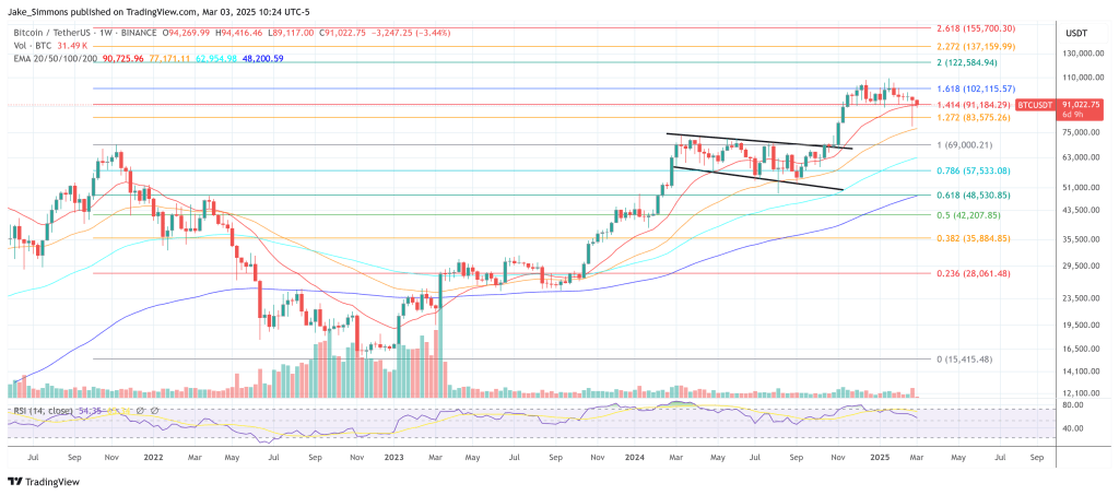
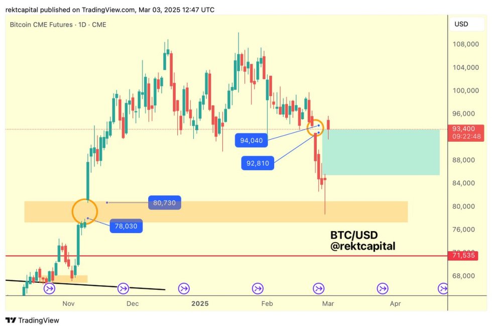
 | This space has many technical indicators that are believed to provide information on whether the bear bottom or local bottom is in or not. All these indicators worked well in the past. However, this time IS different, as many of the indicators failed to do their jobs. I will present 5 common indicators below that identified previous bear market lows, that mostly did a good job to identify the June 2022 low, yet failed to identify the new November low. So, yes, victory for the people that were critical of these five bottom indicators. If there was ever a moment to shout 'LOL TA IS ASTROLOGY', this is the time. You were right! I am not sure why this time is different, is it: Black swan with FTX? Economy much worse? Whales are aware of these indicators and abuse them? All of the above? TA sucks? Something else? Anyways, let's get to business: (1) Rainbow Price Chart The Rainbow Chart was made in 2014 and had not been adjusted since then. The blue 'Basically a Fire Sale' held and marked the bottom in 2015, 2016, 2019, and 2020. All looked fine in 2022 too, but then the FTX capitulation proved too much for this chart to handle (see red circle area). As a result, the author retired this chart and made a new chart, so version 2, with updated data. (2) Weekly RSI The relative strength index (RSI) reflects the strength in the market at a moment in time. In past bear markets, weekly RSI hit oversold levels (beneath the purple band on the picture below, highlighted with red circle) on the weekly time frame at the low and then bounced. The exact same thing happened again over this summer. However, the RSI low was not the bottom this time, so this indicator did not work. (3) Monthly MACD The MACD is a trend-following indicator and can help gauge whether an asset is overbought or oversold, alerting traders to the strength of a directional move, and warning of a potential price reversal. The MACD is displayed under the Bitcoin Monthly chart below. Every previous bear market when on the Monthly timeframe the trend shifted and the histogram had 'peaked' (dark red bars ended, lighter red bars started), the bear market bottom had already been in. These moments are identified with a purple vertical line. This time, us shifting from dark red to lighter red was not the low. (4) 200 week moving average In the past, the 200 week moving average was a key level of support that never really got broken, although we dipped under it for a brief moment in time (see red arrows). We went under the 200 week moving average in June, tried to reclaim it, but eventually rejected off it and did not even retest the moving average (see red circle area). This period from start till now has already lasted for 24 weeks, which is very different from before. Bitcoin weekly + 200 moving average (5) 100 week moving average + 20 week moving average This is a weird one but let me explain. Everytime the 20 weekly moving average (blue line) crossed down the 100 weekly moving average (purple line), the bottom of the bear market was in within a week. I highlighted these periods with a red circle. The same thing happened again in June. BUT, this time that period was not the low so this one didnt work either. Bitcoin weekly + 20 moving average (blue) and 100 moving average (purple) Meme Bonus: Not even the dinosaur worked this time. :-) [link] [comments] |

You can get bonuses upto $100 FREE BONUS when you:
💰 Install these recommended apps:
💲 SocialGood - 100% Crypto Back on Everyday Shopping
💲 xPortal - The DeFi For The Next Billion
💲 CryptoTab Browser - Lightweight, fast, and ready to mine!
💰 Register on these recommended exchanges:
🟡 Binance🟡 Bitfinex🟡 Bitmart🟡 Bittrex🟡 Bitget
🟡 CoinEx🟡 Crypto.com🟡 Gate.io🟡 Huobi🟡 Kucoin.


Comments