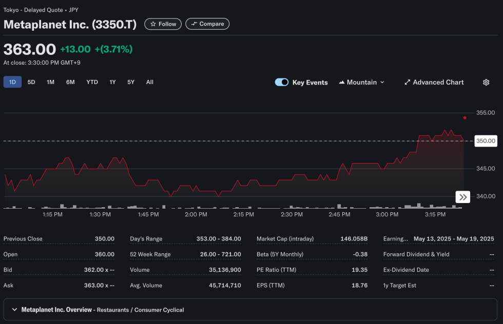
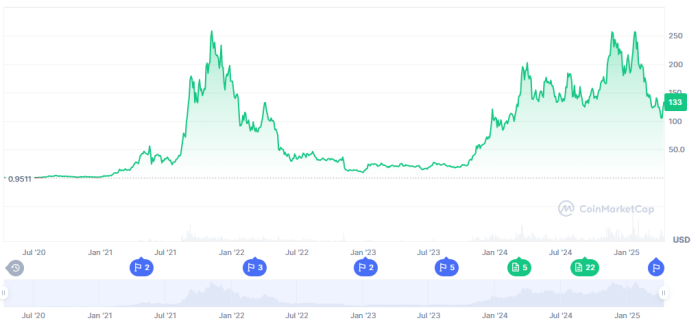
 | The Wyckoff theory can not only be applied to distribution phases as we have seen mentioned in countless videos recently, it also describes accumulation phases. Here is a chart of how this looks like in the theory: Wyckoff accumulation events and phases I have taken the recent BTC price history and tried to find similarities with this theory. This led to the following graphic: Wyckoff accumulation applied to recent BTC price history I found it interesting how similar features can be found in both graphs and would like to hear your opinion on this. IF this comparison is accurate and IF price continues as the theory predicts, we COULD see some further short downwards moves before reaching the next phases which describe increasing prices and maybe the journey to new ATHs. Note: We cannot know if the price actually follows this pattern or not, this is a simple observation and comparison of two charts. Do not make decisions based on this. This is not financial advice. The detailed explanation of each event and phase can be found in the source: https://school.stockcharts.com/doku.php?id=market_analysis:the_wyckoff_method [link] [comments] |

You can get bonuses upto $100 FREE BONUS when you:
💰 Install these recommended apps:
💲 SocialGood - 100% Crypto Back on Everyday Shopping
💲 xPortal - The DeFi For The Next Billion
💲 CryptoTab Browser - Lightweight, fast, and ready to mine!
💰 Register on these recommended exchanges:
🟡 Binance🟡 Bitfinex🟡 Bitmart🟡 Bittrex🟡 Bitget
🟡 CoinEx🟡 Crypto.com🟡 Gate.io🟡 Huobi🟡 Kucoin.


Comments