Cryptocoins Exchanges / Binance - 2 years ago
What does the “B” mean on the chart??
submitted by /u/Brandon_29cr [link] [comments]
Cryptocoins Exchanges / Binance - 2 years ago
submitted by /u/Brandon_29cr [link] [comments]
Cryptocoins Exchanges / Binance - 2 years ago
submitted by /u/rody143 [link] [comments]
Cryptocoins News / NewsBTC - 2 years ago
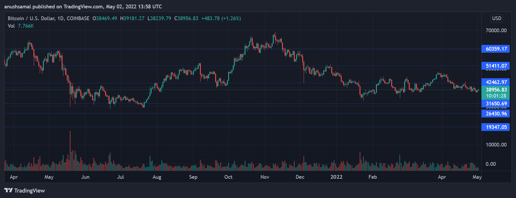
Bitcoin over the weekend was seen trading below its critical price support as broader market weakness continues. Traders’ confidence in the asset has remained quite low considering the selling pressure in the market. The prices have currently plumme...
Cryptocoins Exchanges / Binance - 2 years ago
submitted by /u/Wabi-Sabibitch [link] [comments]
Cryptocoins Exchanges / Binance - 2 years ago
submitted by /u/Heymiko [link] [comments]

Cryptocoins News / The Cointelegraph - 2 years ago
Okay Bears, a Solana (SOL)-powered nonfungible token (NFT), managed to top OpenSea’s 24-hour sales tracker for the first time earlier on Thursday, beating out all other Ethereum (ETH) projects on offer. It’s the first time a Solana NFT project has re...
Cryptocoins News / Blockchain - 2 years ago
Banking giant Standard Chartered has entered the metaverse with The Sandbox to build a virtual space for its clients and supporters. The UK-based multinational banking and financial services company said that its virtual land for the Hong Kong bran...
by COINS NEWS - 2 years ago
Somewhere The Rainbow Chart for Bitcoin is pretty much a fun way of looking at long term price movements, disregarding the daily volatility “noise”. The color bands follow a logarithmic regression (introduced by Bitcointalk User trolol...

Cryptocoins News / The Cointelegraph - 2 years ago
Bitcoin (BTC) is facing a rare chart phenomenon that has historically resulted in 50% price drawdowns, new data shows.In a tweet on April 25, popular account Nunya Bizniz noted a fresh warning sign from two key moving averages on BTC/USD.Analyst: BTC...
Bitcoin News / Bitcoin.com - 2 years ago
Standard Chartered Bank has become the latest major bank to enter the metaverse. The bank has acquired “virtual land at The Sandbox metaverse’s Mega City district, a culture hub based on or inspired by Hong Kong talents.”...
Cryptocoins Exchanges / Binance - 2 years ago
submitted by /u/Heymiko [link] [comments]
Cryptocoins News / NewsBTC - 2 years ago
Bitcoin had been on a downtrend for the past few weeks, the coin, however, started to show an uptrend over the past 48 hours. BTC was optimistic as the coin finally broke over its crucial resistance of $40,000. It was seen trading above $41,000 at t...
by COINS NEWS - 2 years ago
It looks like the deflationary pressures of boating accidents have finally caught up with supply. Monero climbing slowly, day by day... breaking some resistance levels and I don't see anyone talking about it really... a zero hype rally? Has the w...
by COINS NEWS - 2 years ago
submitted by /u/GreedyRichardNeal [link] [comments]
by COINS NEWS - 2 years ago
The data is from the newsletter just converted into a piechart ... I just wanted to test my new CLI skills of parsing this data and transforming it into a chart: ETH 32.21% | BTC 22.32% | SOL 8.65% | DOT 6.07% | ATOM 4.90% | UST 3.85% | RUNE 3....
by COINS NEWS - 2 years ago
This chart was meant to show the Bitcoin price... This is the chart that should show the Bitcoin price. But if you look there on the X-axis you see how they suddenly switched from years to months. This is just pain in my eyes as a fell...

Cryptocoins News / The Cointelegraph - 2 years ago
Solana (SOL) risks crashing 35% in the coming days as it comes closer to painting a so-called “megaphone” pattern.SOL price “megaphone” patternIn detail, megaphone setups consist of a minimum of lower lows and two higher highs forming during a period...
Cryptocoins Exchanges / Binance - 2 years ago
submitted by /u/Dizzy_Difference_361 [link] [comments]

Cryptocoins News / NewsBTC - 2 years ago
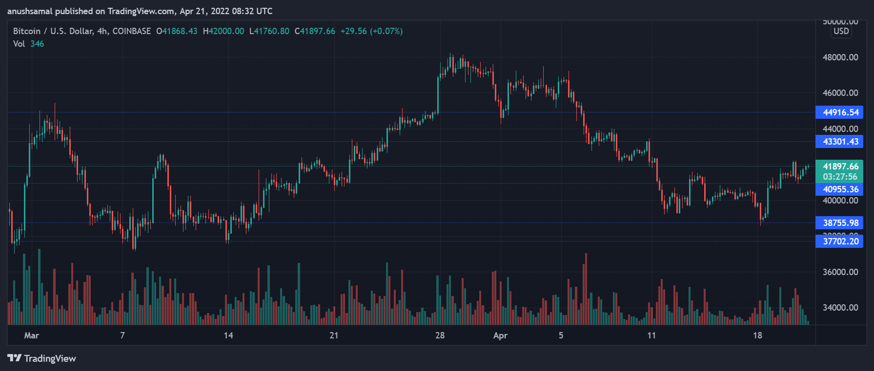
There are only hours remaining until the Q1 2022 close in Bitcoin price action. With the important quarterly candle set to close tonight, let’s look at what technicals might say about the direction of the next quarter. The first quarter of a year, o...
Cryptocoins Exchanges / Binance - 2 years ago
submitted by /u/shitcoining2themoon [link] [comments]
More / Etherum Reddit - 2 years ago
submitted by /u/GMEthLoopring [link] [comments]

Cryptocoins News / The Cointelegraph - 2 years ago
Bitcoin (BTC) further tested $38,000 overnight as the weekend began with uncertainty among traders.BTC/USD 1-hour candle chart (Bitstamp). Source: TradingView3-day chart could be "precursor" for weekly Data from Cointelegraph Markets Pro and TradingV...
Cryptocoins News / The Cointelegraph - 2 years ago
Bitcoin (BTC) further tested $38,000 overnight as the weekend began with uncertainty among traders.BTC/USD 1-hour candle chart (Bitstamp). Source: TradingView3-day chart could be “precursor” for weekly Data from Cointelegraph Markets Pro and TradingV...
by COINS NEWS - 2 years ago
Bitcoin has been slowly climbing out of its $33K hole from January, and has been finding higher lows for over a month. However, still struggling with new highs. This is a stark contrast to the stock market plummeting. Finding news lows with no...
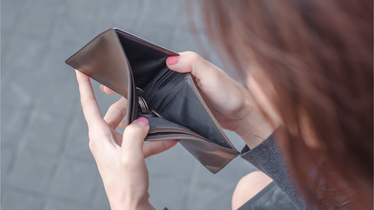
Bitcoin News / Bitcoin.com - 2 years ago
Inflation continues to rear its ugly head in the lives of Americans, as 64% of U.S. residents are living paycheck to paycheck. Equities futures indicate Wednesday’s trading sessions may see stocks heal after the last two days of significant ca...
